Showing posts with label sanding. Show all posts

Monday, September 10, 2012

Making a Mountain (Scrapbook Layout)

While trying to come up with ideas for the Utah-based honeymoon album I a making for our recently married niece, I decided to look at pictures on the internet from scenic vistas throughout the state.  I saw one that was just perfectly framed, and it hit me.  it is layers of mountains... I bet I could make a page based on this picture.  The original picture if found at the Bess Realty Group website, believe it or not.
First thing's first.  I collected cardstock from my collection that matched well enough to make the layered colors.  For the sky background and farthest mountains, I used cardstock with white centers, so I could sand them (as I will show a little later).  The rest was from my beloved Bazzill cardstock collection.  And I pulled all my green Ranger Distress inks and a couple of extras (Black Soot, Chipped Sapphire, Weatherd Wood, Crushed Olive, Bundled Sage, Forest Moss, Peeled Paint, Shabby Shutters, and Pine Needless).  The rest of the equipment are: a pair of scissors, a fine knife for detailed cutting, a very thin (#005) marker for light details, and a nail file for sanding.
2012-09-01_13-54-53_175

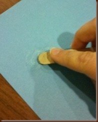
The sky is easy enough to do.  I could just leave the pretty light blue background plain, but I wanted to put a scant few clouds, like in the picture.  So I tore the top off of the file, to make myself a tiny file, and sanded in a circular motion until I got the shapes I liked.  I also used some Q-tips for painting, but forgot to add them to the picture.  Easy.
2012-09-01_13-46-17_361          2012-09-01_14-05-53_844

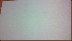
Next, I traced a mountain range on the gray-blue paper, putting the highest peak on the right page, and lowering the left side so it will fall under the next layer.  I cut this out, using the fine blade to get a couple of cuts a little more rounded.  I inked the edges of the mountains with the Weathered Wood ink to disguise the white center.
2012-09-01_13-56-52_3082012-09-01_13-59-55_543

Before I get to the distressing of it all, I went ahead and cut out the rest of the layers.  Next up is the blue-green paper.  On the left it rises above the mountain in the background, and on the right it is basically on the same level while the mountain towers above it.  I just freehanded a few mounds, making sure that they were not too high to cut off the mountain, or too low to make the front range look weird.  Then the front, light green layer, starts on the right about halfway down the page and just curves down across both pages, until it is close to the bottom left edge.  I used one piece of paper for both the left and right, to conserve.  I hoard my Bazzill paper almost religiously.
2012-09-01_14-05-00_149

Here is, in my opinion, the coolest part.  I cut two and a half inches off the bottom to reduce bulk, but you can leave it in if you want to.  Then I wadded them up into small balls.  I carefully pulled them back out, and didn't flatten.  I used another piece of the nail file to sand certain areas, easily done by sanding the folds, to resemble little snow trails like in the picture.  To make the mountain shadows, I used Chipped Sapphire and rubbed it where I wanted it with my finger.  This gave it a smudgy look, instead of just inking any folds from the crumbling.  When the ink dries, then I flattened it enough to tape it down onto the background.
2012-09-01_14-31-23_231

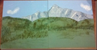
For the middle range, notice that there are trees on them.  However, they are so small that I was pretty sure I couldn't draw them.  So, I used the cast off paper from when I cut it and experimented with my greens until I found three that looked good to layer over each other.  I chose (Bundled Sage, Forest Moss, and Pine Needless).  I took the lightest ink, Forest Moss, and just slid it back and forth on the page, to give a layer of color to the matte green background.  Then, I took Bundled Sage and a Q-tip.  I tapped the tip onto the ink pad a few times until it was saturated, and then just made lines in areas where trees might be on both pages.  The darkest ink, Pine Needles, repeated these lines, until I had a mess of lines in groups on this layer.  I let it dry and taped it down onto the page.  It looks cool to me.
2012-09-01_14-58-05_780
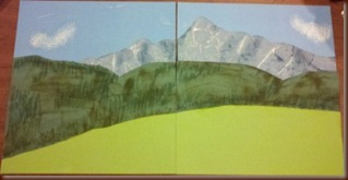
The bottom range is brighter, with larger trees. I had planned to make some trees with green mulberry paper, but I was unable to locate any.  Maybe mulberry has fallen out of style.  So, I decided to leave it blank.  This will be where any pictures or journaling my niece wants to do will be added.
2012-09-01_15-00-18_99
The final result is very pretty.  And I proved to myself that I can be creative without a template or someone else's help.  And so can you.  Now, go choose a simple picture and amaze me.

Sunday, September 9, 2012

Scrapbooking with a Template, Take One

For those of us who want the time to enjoy scrapbooking as well as making something interesting, there are a plethora of helpers out there.  They are called templates, and they can be found in blogs, magazines, magazine websites, and even your fellow scrapbookers have probably doodled lots of them.  I know I have.  I buy magazines every so often and like to read them, and then cut out everything I like and add it to a box.  They come in handy when I have scrapper’s block, or when I want to make something intricate but don’t have the time or inclination to think of what to do.
Today, I made a two-page spread for the honeymoon scrapbook I am working on using a template.  Yes, it was a blank page for someone else to put their pictures in.  But that doesn’t mean you cannot do this for yourself.  Why not make blank pages for yourself, so that if something awesome comes along, you already have pages ready to put them into to wow your family and friends.  It is faster, in my opinion, to make blank pages than to make ones for pictures you have had sitting around for ages.  But don’t worry, I have ways to make those pages go faster as well.  Anyway, let us continue.
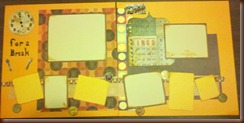
Here is the template.  It was cut from a magazine, but honestly I could not tell you which one, because I cut this out well before I decided to make a blog.  It looks cool, and not too difficult (in my opinion).  The best thing about this template, and what makes it fairly easy, is that dimensions are written on there for everything I have to cut.  After that, picking out the papers to use is the fun part.  I only used paper, a paper cutter, and a little ink for cut edges for this page.
2012-09-01_11-22-58_373
As you can see, I decided to move away from the greens and browns of the scrapbook so far and use a bright, delicious orange for the background.  This is going to be a page about food and taking a break, so I thought it would be appropriate.
2012-09-01_12-16-02_122
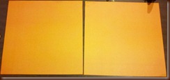
When I am making blank pages, I work from back to front.  I start with the base paper, then the background paper(s), any large decorations, journaling, photo mats, and embellishments.  I know this sounds like “duh, how else would you do it?”  Well, normally I pick pictures that I want to see together, matte them, then figure out what should go behind them to make up the page.  So I pretty much am going to go backwards for me here.  After laying out the base papers, I cut out and tape down the background paper.  There are two large rectangles in this template that make up the background.  I cut the large piece of paper behind the picture mats.  It looks like it is supposed to be a single piece, but I used an 8.5 x 11 piece of paper, which wasn’t big enough.  So, I used two coordinating pieces of paper.  I think it looks kind of funky.
2012-09-01_12-18-44_833
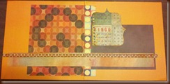
The second back paper I decided to make a potato brown.  For the large, interesting shape, I freehanded a previously used piece of Ranger Distress paper.  It had a kooky bingo pattern on it that I like, but can never find a use for.  One of the best things about abstract shapes used for filler is that they don’t specifically have to match the theme.  Their only job is to look good.  And possibly provide a nice space for journaling if need be.  Which I think this will likely be.
2012-09-01_12-20-37_87
Next came the long pieces of paper across the bottom of the page.  Now, it looked to me like these could oh so easily be have been ribbon, or fabric or anything I wanted it to be.  For me, I saw this as a perfect way to use up those extra bits of paper I always get when I trim down background paper.  So I went into my scrap paper stash and found two pieces that matched the color scheme and were close enough to the right sizes for the page.  Note that I said close enough.  Like I say, templates and measurements – at least on this blog – are guidelines, not rules set in stone.  Besides, they look sweet.
2012-09-01_12-28-45_993
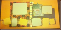
Remember that potato brown paper I cut for one of the background papers?  I cut as many mattes as I could from the leftover for about four of the picture sizes listed on the template.  I put off white cardstock on those mattes, inked around the edges with walnut Ranger Distress Ink.  For the rest of the photo mattes I used a lighter orange cardstock than that of the main background.  Still sweet.
2012-09-01_12-33-14_81
Last but not least, I added
2012-09-01_12-57-44_496

Saturday, August 25, 2012

Stress-Relieving Scrapbook Prep

There is a scrapbook trend that has been building for a few years now that I am an avid member of: distressing.  Tim Holtz has cornered the market in my mind, making everything from my favorite inks (Ranger Distress Inks, I have every one they make), to scrapbook tape (that looks like things such as strips of music, ruler tape, you name it) and blank ephemera that is made to be tarnished, dyed, stained, ripped, scratched… pretty much anything you can do to it.  The result of all this destruction is a page or album or work of art that looks worn, well used…. not showroom new and untouched.  I love it!  Now, buying all these things to do the distressing can be expensive, but I have a few methods that I frequently use in scrapbooking that are easy, pretty cheap, and well.. they relieve my stress on those bad days.

First up, the simple art of paper tearing.  There is a class of scrapbookers that think tearing a piece of paper that someone lovingly designed to be perfectly adapted to your needs is a sacrilege.  I say raspberries!  I learned this while working on my very first scrapbook page.  It was a two-page spread for my recently deceased grandparents.  I had a perfect page of assorted flowers… but I had only one.  So, I put the page on the table, face up, and tore it by pulling it diagonally towards me, raggedly down the center.  I put each piece on its own 12x12 sheet of sage green cardstock.  Put a little ink on the white edges with an ink pad (or your finger for a more subtle, smudgy look) and now I had two coordinating pages.  After that, a little vellum and a couple of pictures and my pages were done.  And they still are some of my favorites.  Tear paper and stick down every edge but one, and use them as pockets for tickets or little items you want to keep.  Another trick is to use torn paper strips to make a rough frame or mat look for pictures.  I like to take papers I don’t use (or really don’t like anymore) and pre-tear them into all sorts of sizes and shapes to use at a later date.  And the tearing sounds so delicious.

The second technique is staining.  Tea dye is the most popular type.  Basically, you choose your paper (don’t use cardstock, it is harder to stain) and submerge it in a nice, unsweet tea bath.  Just a few seconds for a light dye, or up to a minute for a dark dye.  Mind you, you need a flat surface to dry these on that has something absorbent to soak up extra liquid and… leave it there.  But, if you don’t want a whole page… that is where the fun begins.  Coffee and colas are also great stains (please, hold the sugars and creams though).  have two shallow bowls or tea saucers with coffee or a soda.  Take a mug, dunk it in the coffee and then place it on the paper.  drizzle the drink in random places on the page.  Heck, cover your table with papers you want to stain and have fun flicking straws of tea or what have you on them.  Go nuts.  Let dry overnight and they look nice and worn.

The third technique is inking.  I have already described inking the edges of torn paper.  Ranger Distress Inks are my ink of choice here, but any ink that isn’t pigment based works well here.  One way is to use the inks (inks in dropper bottles, not ink pads) for the second technique of staining.  It only takes a drop or two (or more if you want a darker stain) and the whole range of colors is yours for the dyeing.  Another way is to take the ink pad, holding it in a face-down angle towards the paper, and drag it across the edge of the paper.  You can hold it more parallel to the paper if you want more ink further into the paper, or more perpendicular if you want just the very edge inked.  This goes an amazing way towards making a factory produced piece of paper look more homemade, and it is a great way to cover up any of the white core that can easily be seen from cutting the paper.  yet another idea is to stamp an image with these dye based inks randomly on all over the paper.  Before it dries, spritz it with water, and let the ink move where it may.  Of course, you can help it along by propping the paper up slightly, or by lightly heat setting it with a  hair dryer on low or an embossing gun.  This kind of look like it started raining while you were stamping.  A really cool layer to add to this is to sprinkle salt (table or rock) onto the freshly inked and wetted paper.  The salt soaks up the ink and water where it fell and looks awesome!

The fourth technique is crumpling.  This, to me, is the most stress relieving, and can easily be done with any type of paper.  Wad up a piece of paper (I use the whole 12x12 sheets, but you can wad up even the smallest bits if you need to).  The un-wad it… very carefully.  Here is the cool trick.  Flip the paper and wad it from another angle.  Now you have creases going up and down the paper.  You could stop here, or you could make it look more beaten up.  Flatten the paper on your table.  Take an ink pad (I love the Ranger browns here, but whatever coordinates will do), and run the whole pad lightly across the paper, inking only the raised creases.  I like to do it in certain spots instead of all over, which makes it kind of look like it was stepped on. If you ink all the creases, you have created a new pattern on the paper.  Use the water spritzing idea from above and spray the inked creases, making the ink snake out into cooler designs.  You can now flatten the paper back out by pressing it between some heavy books overnight or use it nicely crumpled to add texture to your next scrapbooking adventure.

The last technique is sanding.  Crumpled paper can be stressed by lightly sanding it with a nail file (not too many strokes, unless you want a holey look) which will help the creases stand out by whitening them. Sand the edges of flat paper to create a light border.  Sand the edges of several sizes of circles, crumple them, layer them, and staple the center to create a rough flower.  Make up your own use for sanding, but it really is easy.

Just doing one of these techniques for an hour or so to create distressed, “ugly” paper is a great way to work out any aggression accumulated throughout the day.  And the result is paper that is now uniquely yours, and makes those scrapbooking days pass a lot faster when you can finally get around to them.